3D Volume
Concept
We are intended to do research on the concept of both physical and metaphorical vessels and their meaning in both historical and fictional settings. Using the information we have obtained, we will then create a vessel in Google Sketchup that “carries” a facet of our personalities. This can be interpreted literally or figuratively, and we are left to our creative devices to decide how we should go about creating this project, so long as it logically aligns with the concepts we are trying to portray.
We are intended to do research on the concept of both physical and metaphorical vessels and their meaning in both historical and fictional settings. Using the information we have obtained, we will then create a vessel in Google Sketchup that “carries” a facet of our personalities. This can be interpreted literally or figuratively, and we are left to our creative devices to decide how we should go about creating this project, so long as it logically aligns with the concepts we are trying to portray.
Pre-Write
Volume is the measure of how much space an object takes up. It can function in relation with mass, as mass is the measure of the amount of matter in an object, but each has little bearing on the other. An object can have a high mass and a low volume, or a low mass and a high volume, or both high volume and mass or low volume and mass. Sculptures focusing on volume often intend to create as much space out of as little mass as possible, using techniques such as weaving, folding, and slotting. The concepts of volume are used to help artists and designers get an idea for the depth that an object will need to simulate to look realistic, or to help blueprinters concept how large an object will be when it is physically made.
At first, I was considering emulating a part of my nature as a vagabond-like individual; I have a tendency not to linger in one place, or with one object or concept for too long. I like flittering around between things that interest me and keeping in motion. The idea also occurred to me to try and use my love of anatomy and the grace of the human body--I was thinking of using ballet dancers, since I hold a particular fondness for them. However, whilst looking for inspiration, I was listening to a song that I like quite a bit, and I saw a comment below it that deeply criticized the quality of the song. Basically, this individual took a big old dump on the passionate work that the singers and artists had put into their creation. I knew that this person was just being opinionated, but I couldn’t stop myself from immediately feeling defensive, and full of a need to validate that this song was a great work as I saw it. I combed the instrumental and lyrics for flaws, trying to justify them, when after a moment, I paused. I had let my passion and my pride get ahead of me, and in that instant, I found myself reflecting on just how much emotion this tiny little comment had ignited in me. I think that for my project, I’d like to find a way to express the part of my personality that is protective and passionate--the part that defends what I care about, because that is a very big part. I’m very prideful, and when someone challenges something I care about, I feel a powerfully impulsive need to protect it. I’m thinking of creating a literal urn or jar to keep the metaphor inside, but perhaps with something bursting out of the lid in order to defend the jar from harm. I’m considering putting it on a stone pedestal, which is ornate and sturdy, proper to support someone’s pride, but also narrow, so whatever sits atop it could fall off easily if forced.
Rough Drafts
Group 1:
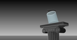
This is one angle of the pedestal and jar in a gray and white palette.
Another shot of the first angle in an orange and yellow palette.
Another shot of the first angle in a white, gray, and beige palette.
Group 2:

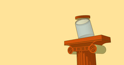
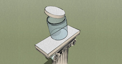
This is another angle of the pedestal and jar in a blue palette with white lines and shadows.
Another shot of the second angle in a green palette with shadows.
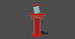
Another shot of the second angle in a red and gray palette, white outlines, and shadows.
Group 3:
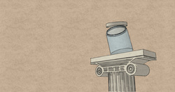
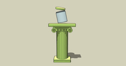
This is another angle of the pedestal and jar with a white and gray palette and shadows.
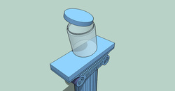
Another shot of the third angle in a blue palette with shadows.
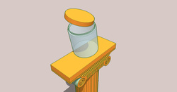
Another shot of the third angle in a yellow and orange palette with shadows.
Sketch:

The outlines of the pedestal and jar were printed onto a blank
sheet of white paper, where I drew the reaching hands and the
sparkling swirls in graphite. I also shaded the pillar and the lid
of the jar a bit.
Final Draft

This is the finished product after the pencil sketch had been
rendered in Photoshop CS6 and the rough drafts had been
layered over it. I played with the hue and saturation,
brightness, levels, and added a gradient in the background.
The sparkles in the smoke were done with a custom brush
for the Paintbrush tool.
Reflection
1. content - how are you capturing a sense of volume? did drawing/shading help build a sense of depth?
The shading of the pedestal in particular helped to simulate depth, and I think that the hands wouldn’t have quite the pop they do without some darkness and contrast in their design. Using slightly color-blurred areas around the outside of the pedestal and the jar, I created a sense of those two objects being actually pasted in, or perhaps that the background was pasted behind them. The pedestal and jar have much softer shading than the hands and other traditionally drawn elements as well as more vivid colors, which add emphasis to them as focal points. Though the shading is intentionally sketchy, I feel that a sense of volume was successfully created in this piece.
2. concept - what are you illustrating and how do the volumetric elements help convey your big idea? in what way did your traditional drawing help explore the idea? did you capture your ‘self-portrait’?
I was trying to demonstrate the concept of pride, and how it is powerful but also fragile. The glass jar represents my pride, and the smoke gushing from within it represents my need and ability to defend my pride. So long as the jar stays in tact, the core from which the smoke flows will remain safe. However, as more ideas and voices challenge my pride (the hands), it has to work harder to defend itself, and the jar begins to teeter atop the pedestal. One wrong tilt or one strong push could send it crashing to the floor, and it would shatter. This symbolizes the puncturing of an ego, or the breaking of pride. I think that the traditional drawing helps set the sketchy, stark looking hands apart from the softer jar and pedestal, and it allowed me more freedom when creating background elements. Overall, I think this captured my self-portrait very well.
3. process - in what ways did the sketchup exploration help or hinder your process in this project? how did revising in photoshop help you to improve the design? are you happy with the process?
I was surprised at how incredibly useful and Sketchup was for this project. The construction of both the glass jar and the (presumably) stone pedestal were made easy with the tools that Sketchup offers, and the ability to turn objects in three dimensions was absolutely invaluable. Revising in Photoshop allowed me to take the clean but simplistic image I created in Sketchup and give it a more exciting, romanticized feel. The bold colors and outlines as well as the visual effects that Photoshop allowed me to create worked so well with the clear, vivid outlines that I made in Sketchup. I am very happy with this process indeed.
4. product - tell me about the final image. is it good or bad? did you capture what you wanted to say? is it finished or would you like to do something else with it?
I think that this image is quite good, albeit not too far out of my comfort zone. I have a tendency to use dark, warm colors and highly-contrasting values in my work, so I’m trying to stray from that a bit. The piece is finished to me, and I’m very happy with it, but I think that I definitely could have taken a different approach in its production. I’m not sure how, but I’d like to do a project that feels totally out of the box for me. I’ll do some thinking about this project and the potential for the next one, and try to incorporate my desires into our next assignment.
5. reflection - what did you learn from this assignment? what will you do the same or differently next time? how does the lessons learned fit into the overall flow of the course?
I learned about some of the more impressive aspects of Sketchup, and how simplifying the way that you do things can actually be helpful. I was going way overboard when I was trying to create my pedestal especially, but once I stopped trying to make everything huge and detailed, I was able to utilize grids and simple lines to create a nice, clean object. Everything I’ve learned up to this point came in handy, and I continue to be pleasantly surprised at just how much we’re being taught with these projects and assignments.
