3D Line
Concept
It seems that we’re using only lines to create a three-dimensional piece in Sketchup, or creating a sense of flow and linear connection by using both physical and implied lines between our three-dimensional objects. We will be exploring the concepts of linear connection, and the way that lines can be used to create both stability and flow within a piece, as well as imply association between elements.
It seems that we’re using only lines to create a three-dimensional piece in Sketchup, or creating a sense of flow and linear connection by using both physical and implied lines between our three-dimensional objects. We will be exploring the concepts of linear connection, and the way that lines can be used to create both stability and flow within a piece, as well as imply association between elements.
Pre-Write
A line is a singular stretch of substance that does not create a complete shape and does not possess form beyond a simple strand of substance. Lines exist both physically and in an implied aspect in all visual artwork. In order to compose works consistent with strong continuity and rhythm, the elements of lines can be manipulated in an infinite amount of ways. Lines can be curvilinear, consisting of curved or smooth forms, or rectilinear, consisting of straight or angular forms. Curvilinear lines are frequently found in organic shapes and concepts, and tend to create a relaxed, flowing legato feeling. Inversely, rectilinear lines are more commonly found in geometric forms, and tend to create a sharp, energetic staccato feeling.
As well as existing physically within a piece, lines can also be implied and used as grids to help manage a sense of stability within a piece, or to help preserve flow. Lines are important when composing rough drafts; having guidelines drawn in place make a monumental difference in preserving flow and creating perspective when mapping out a design. Once a design is sound and the piece is finished, the guidelines may still exist in the implied form between objects, preserving the linear flows between elements. In this class, for example, our point-perspective drawings started out with definite lines to help us map out where the objects within the piece should go, but once the lines were erased, our pictures still kept the very clear flow that the guidelines had set in place.
Rough Drafts
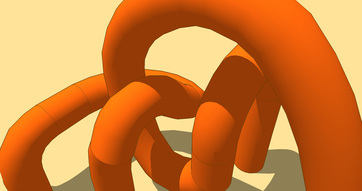
This is a long stretch of curved, cylindrical material, drawn out using a tool in
SketchUp that allows an artist to make a shape three-dimensional along a
curved line.
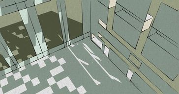
This is a series of holes cut into a cubic structure that have light shining through
the ceiling to cast grid-like shadows.
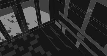
This is the same model and angle as the picture above, except this one is done in
a grayscale palette instead of a white and beige palette.
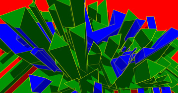
This is a series of triangles and polygons made three-dimensional with the push/
pull tool, colored in the "Google" palette, which consists of red, green, and blue.
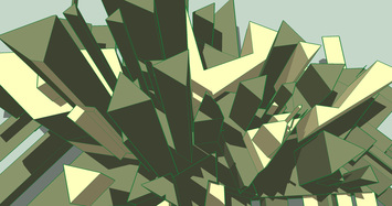
This is the same model and angle as the image above except that this one was
done in a green, gray, and beige palette instead of the "Google" palette.
Final Drafts
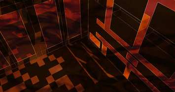
This is the second model and angle with color adjustments, hue/saturation
adjustments, brightness adjustments, and a royalty-free smoke pattern
overlaying.
Reflection
- Content - What types of lines did you portray in your design and why?
I was a big fan of the curvilinear lines, and I thought their design created a lot of interesting depth, but I wanted to try playing with rectilinear a bit. I wanted to see if I could take the angular, straight-flowing lines and give them a sense of spontaneousness and make them seem more dimensional than just straight lines. Everything in my piece could be connected on a grid, but as it is now, it looks fairly disconnected.
- Concept - What are you illustrating and how do the lines help you convey your ideas?
The red and black color scheme that I was going for creates a dire atmosphere, and I created an overlying layer out of very large soda bubbles that I used a tilt blur on to simulate a wispy, smoky texture near the edges. This room looks like the 3-D version of something from an 8-bit horror game, and I think that the rectilinear style was perfect for conveying this. The room has no soft edges and therefore has a somewhat stark and uninviting feel, not considering the oppressive colors and overall darkness.
- Process - In what ways did Sketchup help or hinder your process in this project? How did revising in Photoshop help you to improve the design? Are you happy with the process?
Really, the scrolling in Sketchup makes me nauseous, and it’s kind of hard for me to get a real feel for the controls, but overall, it’s a very neat program. I think that once I get in the groove of using it, Sketchup really does help my creation process and allows me to do things artistically that I’m nowhere near capable of in standard design apparatuses. Revising in Photoshop allowed me to completely alter the mood of the pictures that I took and gave me the opportunity to be very creative with it, but I don’t think I took full advantage of it. I’m happy with the process of going from Sketchup to Photoshop, I just wish that I wouldn’t get motion sick when trying to use the former.
- Product - Tell me about the final image; is it good or bad? Did you capture what you wanted to say? Is it finished or would you like to do something else with it?
I think the image is fairly good, but I can definitely do better. As a personal rule, I try not to do the standardly generic dark, intense, “bad-ass” kind of images that a lot of teenagers are into, but I wanted to go for something that looked like it could be in a videogame, maybe about an apocalypse or something. Because of this, it turned out looking somewhat...unoriginal? I really would have liked to incorporate something to give it a bit more style, and maybe it would have looked better if I had made it larger, but overall, I’m proud of it. It didn’t come out bad-looking, I just think I could have done more with it.
- Reflection - What did you learn from this assignment? What will you do the same or differently next time? How do the lessons learned fit into the overall flow of the course?
I’m starting to learn how to properly use Sketchup, and how the proper use of line techniques can tie a piece together better. The concept of legato and staccato are still a bit unclear to me, but I think that I’m starting to get a better feel for them, so any practice I can have really does help. Next time, I want to try working from a father perspective instead of making a Sketchup model that’s intended to be viewed at close range, and I’d also like to try taking advantage of more Photoshop tools and techniques. What we’ve learned in the lessons incorporated really well into the project, and I even was able to take some of what I learned from our sketching assignments and apply it to my work. I think everything we’re learning is flowing very nicely!
