Letter Art
Concept
To practice the concepts of emphasis, we were instructed to try and make pictures and symbols out of letters and different kinds of fonts. By this point, we had already reviewed the various techniques to show emphasis--size, value, isolation, etc.--so all we had to do was try to utilize them. I liked the idea of using a D as a boat, and from there, I had several ideas for making a pirate ship, among other things. We were shown some examples of this projects that had been created in past years, so it was a bit easier to think of ideas for our own projects.
To practice the concepts of emphasis, we were instructed to try and make pictures and symbols out of letters and different kinds of fonts. By this point, we had already reviewed the various techniques to show emphasis--size, value, isolation, etc.--so all we had to do was try to utilize them. I liked the idea of using a D as a boat, and from there, I had several ideas for making a pirate ship, among other things. We were shown some examples of this projects that had been created in past years, so it was a bit easier to think of ideas for our own projects.
Final Draft
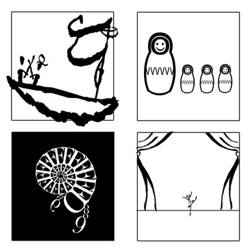
My first piece was meant to be a scene of a pirate ship, in which the captain and a man who is probably a stowaway are having a sword fight on the bow while the large, tattered sail billows on the mast far behind them.
The second picture is of a group of Matryoshka, or nesting dolls, which are usually different sizes but were changed so that one was the emphasis of the drawing.
In the lower left-hand corner, I created a kind of swirling scorpion/crab that gets smaller near the center of its spiral.
The last picture if of a ballerina alone on a desolate stage, and because I have a deep affection for ballet, I had a lot of fun making this picture.
Reflection
Occasionally, inspiration would hit me and I’d come up with an idea that I had to bring to life even if it was difficult. Most of the drawings were started by my typing of random letters in different fonts and seeing if I could make anything out of them in my head. Unfortunately, I found a couple of the designs to be generic or unrelated to the concepts we were trying to portray, but for a batch of a dozen that were made in two days, I think they’re pretty good. I liked twisting and editing letters, and trying to stretch my creativity, so overall, this was a really fun assignment. I think overall, my pictures turned out really well, and it was worth it to make so many pictures to pick from.
Occasionally, inspiration would hit me and I’d come up with an idea that I had to bring to life even if it was difficult. Most of the drawings were started by my typing of random letters in different fonts and seeing if I could make anything out of them in my head. Unfortunately, I found a couple of the designs to be generic or unrelated to the concepts we were trying to portray, but for a batch of a dozen that were made in two days, I think they’re pretty good. I liked twisting and editing letters, and trying to stretch my creativity, so overall, this was a really fun assignment. I think overall, my pictures turned out really well, and it was worth it to make so many pictures to pick from.
