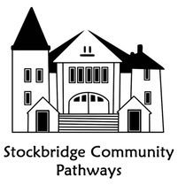
Stockbridge Logo Design
Concept
The idea of this project is to try and create a logo that properly emulates the intentions of the Stockbridge Community Pathways organization. The group, as far as I’ve learned, is a collection of Stockbridge citizens that manage keeping their trails clean and free of litter. Also, we’ve been told that they’re particularly fond of their town hall, so it might be possible to make a vector out of it. The logo has to be a vector and should be capable of being displayed in both black-and-white and color variations.
The idea of this project is to try and create a logo that properly emulates the intentions of the Stockbridge Community Pathways organization. The group, as far as I’ve learned, is a collection of Stockbridge citizens that manage keeping their trails clean and free of litter. Also, we’ve been told that they’re particularly fond of their town hall, so it might be possible to make a vector out of it. The logo has to be a vector and should be capable of being displayed in both black-and-white and color variations.
Rough Drafts
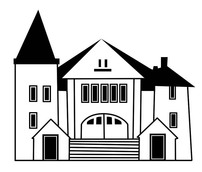
This was the first logo that I designed.
I used a photograph of the Stockbridge town hall to make a simplistic black-and-white vector.
Mr. Chad advised me to try and soften the image a bit due to its rather stark, official look.
I tried to round the corners of the building, but the difference made wasn't very significant.
After adding the text that I had yet to add in my first draft, I decided that I couldn't take this
design much farther and began a new one.
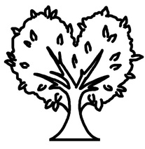
It was suggested to make an image that was a bit gentler and more related to nature. I had the
idea of a tree with leaves in the shape of a heart. I felt that this image was a lot sweeter and helped
to emulate the eco-friendly desires of the group.
This was the image I used as the base for my final.
Final Drafts
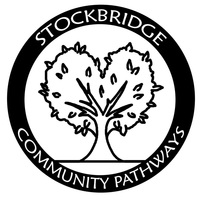
This is the completed logo in its black-and-white format.
I added an outer border with text circling the central image.
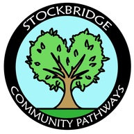
I developed a colored version of the logo with pastel-ish greens and blues.
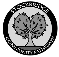
A grayscale version was made by dropping the saturation on the colored version.
I also adjusted the brightness to help the tree in the center stand out more.
Final Reflection
I had initially tried to make a vector out of the town hall, and I was actually pretty proud of the way it turned out. However, Mr. Chad informed me that my vector was kind of sharp-looking, and might have been a bit too stark for the feel of the logo. I tried to make the vector curvier by cleaning up the corners and making them rounder, but the result wasn’t a drastic change. After talking to Mr. Chad again, I decided to try and take a different approach by making the logo a bit softer and cuter. The idea of a tree shaped like a heart came to mind, and the current logo was the result. I also colored the logo in and created a grayscale variation of the coloring. Overall, I think it came out alright, but it’s not very professional looking. For a little community organization, I think it’d be a nice logo, but not something a major company would use.
I had initially tried to make a vector out of the town hall, and I was actually pretty proud of the way it turned out. However, Mr. Chad informed me that my vector was kind of sharp-looking, and might have been a bit too stark for the feel of the logo. I tried to make the vector curvier by cleaning up the corners and making them rounder, but the result wasn’t a drastic change. After talking to Mr. Chad again, I decided to try and take a different approach by making the logo a bit softer and cuter. The idea of a tree shaped like a heart came to mind, and the current logo was the result. I also colored the logo in and created a grayscale variation of the coloring. Overall, I think it came out alright, but it’s not very professional looking. For a little community organization, I think it’d be a nice logo, but not something a major company would use.
